
I Wanted to Make a Game. First, I Had to Learn Its Language.
I wanted to make a game, but I did not know where to start. I also did not know how games present information, guide someone through a round, or respond to a player’s actions. Without that basic language, even a small idea felt hard to shape.
I began calling those familiar conventions “game grammar.” It is my shorthand, not a formal standard or programming syntax. It covers signals such as a turn message, a highlighted result, and a clear way to play again.
The study turned a vague ambition into smaller questions about flow, information, and response. I used tic-tac-toe as a small example because its goal is familiar and a whole round fits on one screen.
Just want to play? Play tic-tac-toe—you do not need to read the study first.
AI and automation helped produce this article. I own AI Maker Lab and take responsibility for the final wording and source checks.
A game has to tell you what happens next
A playable idea needs a path through it, not only an activity in the middle. For tic-tac-toe, the important moments are starting, taking a turn, seeing the outcome, and choosing whether to play again. Thinking about each moment showed me what the player needs before and after touching the board.
I sketched that journey as title → playing → result → replay. These are situations, not necessarily separate pages. A result can appear over the completed board, as it does in this game, while still changing what the player sees and can do.
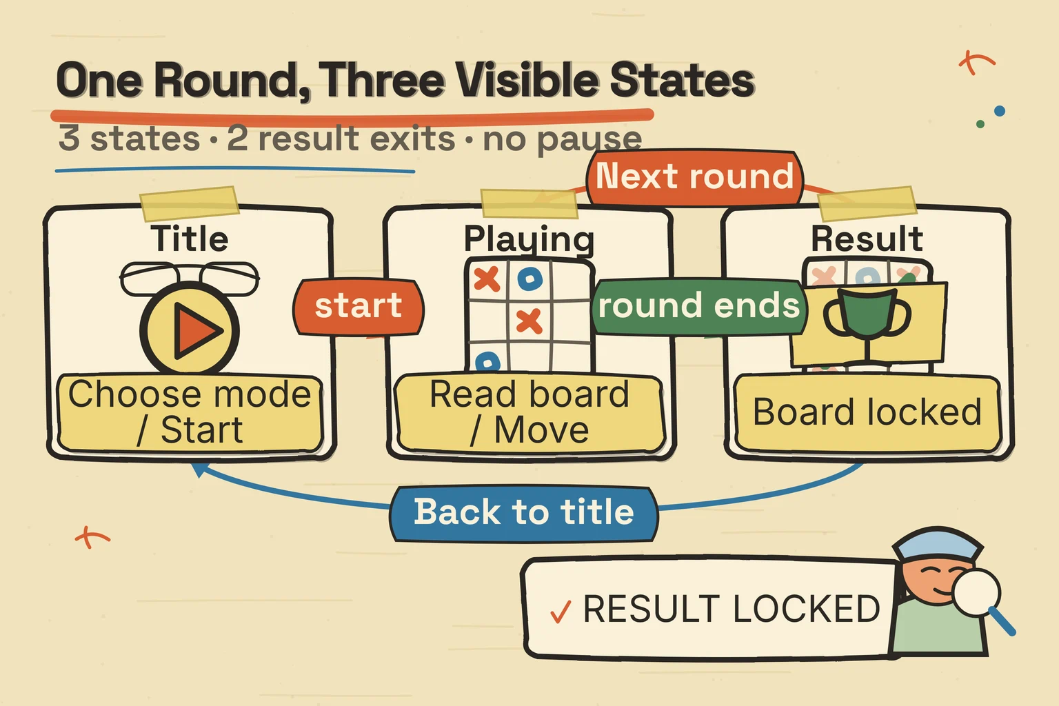
The MDN anatomy of a video game describes a repeating progression: present a situation, accept input, interpret an action, and calculate the next situation. That description gave me a simple way to check the journey. The practical benefit was seeing the whole experience before concentrating on one part of the screen.
The screen is part of the explanation
The screen has to answer immediate questions without a separate manual. Whose turn is it? Where can I play? Who won? In tic-tac-toe, the X and O marks show the history, the status names the current turn or result, and a line identifies the three marks that won.
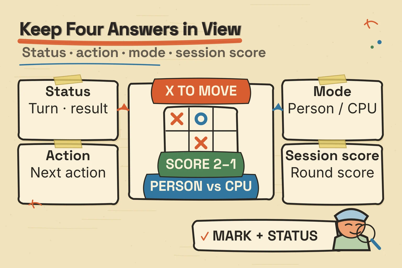
A HUD, or heads-up display, is information kept visible during play, such as status or score. That information can be overlaid on the screen, but games can also place information inside their fictional worlds. A score counter is a simple example of an overlay. A sign that exists beside a road in the game world is part of that world instead.
The 2009 thesis Beyond the HUD gave me vocabulary for thinking about that choice. Erik Fagerholt and Magnus Lorentzon studied interfaces in first-person shooters. Their categories are useful questions, not a rule that every genre should imitate or that one placement is always more immersive.
Controls explain the screen too. Keyboard input only helps when a player can reach an action and see which control has focus. The W3C button pattern describes Space and Enter activation for a focused button. Treating the board cells as real controls makes their availability visible for mouse and keyboard players. The benefit is a clearer decision about what players need to know and where the game should show it.
Effects are a way for the game to answer
Feedback begins with a direct response to an action. Place a mark, and the chosen square changes. Complete a winning row, and the game names the winner and highlights the line. Those responses confirm what happened before any extra flourish enters the design.
“Juice” is a common name for extra response such as movement, sound, particles, or screen shake. The “Juice it or lose it” demonstration layers such techniques onto a plain game. Its companion repository makes examples such as tweening, sound, particles, and shake inspectable. It is a demonstration of possibilities, not a promise that every effect improves every game.
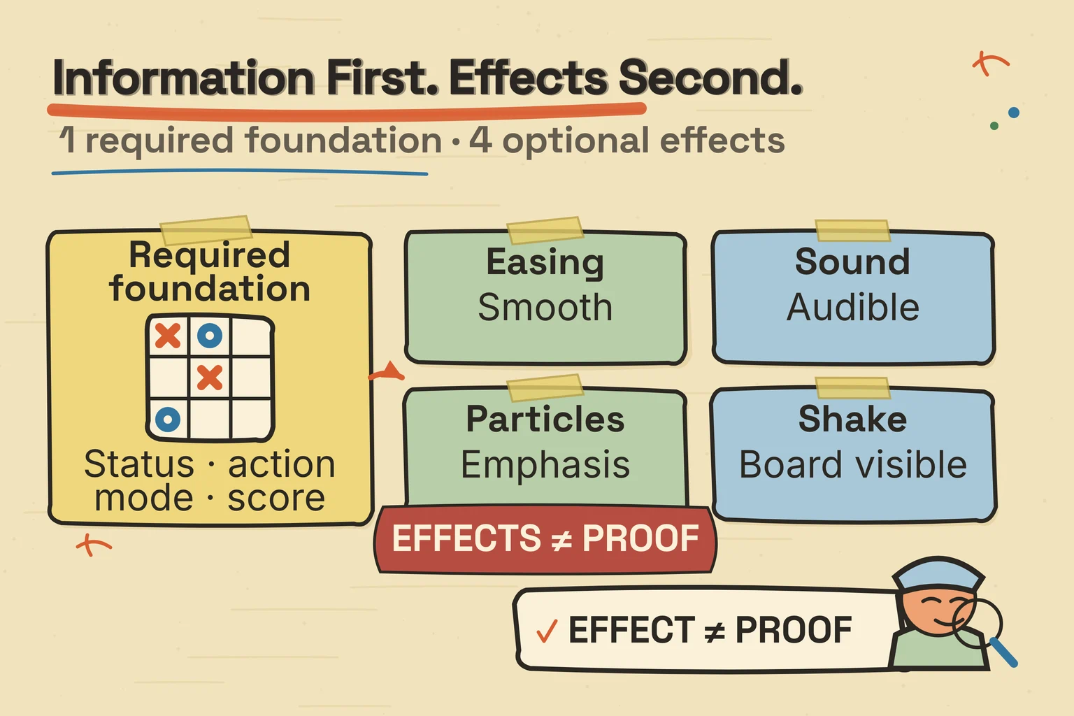
The tic-tac-toe example stays quiet. It uses marks, status changes, visible focus and hover treatments, and a winning line, but no sound, particles, or shake. Separating that implementation from the broader research helped me choose an effect for the action it communicates instead of adding decoration without a purpose.
The study gave me an order to work in
The questions became a compact order I can use when an idea still feels vague:
- Describe the goal and how a round ends.
- Sketch the start, play, result, and replay situations.
- Make the smallest playable rules and controls.
- Show turns and results, then add responses that communicate useful changes.
- Watch someone try it and revise what gets in the way.
The third step includes rules for boundaries as well as successful actions. For example, a finished round no longer accepts moves. The game also offers a computer opponent that chooses from the moves still available, but the player’s journey remains the same.
This order is a useful starting point for this small project, not the one correct workflow for every game. Real-time movement, a longer story, or a different group of players may change the questions and their order.
I have not run an uncoached playtest of this interface yet. A next step is to watch whether someone can choose a mode, finish a round, and restart without an explanation. The Nielsen Norman Group usability guide describes giving a participant tasks and observing behavior. Until that happens here, it is a proposed check rather than a result.
Try the small game—or take the questions to your own
The useful result of this study is a manageable set of questions. What is the flow? What information belongs on the screen? How should the game answer an action? Those questions give me somewhere concrete to begin without pretending they are universal rules.
You can play the tic-tac-toe game simply to enjoy a round. If you are curious, you can also notice how it communicates a win, but that is optional—not homework.
If you want to see the same questions applied to movement and time, the platformer research is an optional next read.
Sources
- Mozilla Developer Network. “Anatomy of a video game.” Publication date not displayed. https://developer.mozilla.org/en-US/docs/Games/Anatomy. Accessed 2026-08-18.
- W3C Web Accessibility Initiative. “Button Pattern.” Publication date not displayed. https://www.w3.org/WAI/ARIA/apg/patterns/button/. Accessed 2026-08-18.
- Fagerholt, Erik, and Magnus Lorentzon. “Beyond the HUD — User Interfaces for Increased Player Immersion in FPS Games.” Master’s thesis, Chalmers University of Technology, 2009. https://odr.chalmers.se/items/d5fe6889-4cc6-49c2-ba56-0d759e2f37eb. Accessed 2026-09-06.
- Jonasson, Martin, and Petri Purho. “Juice it or lose it.” Uploaded 2012-05-24. https://www.youtube.com/watch?v=Fy0aCDmgnxg. Accessed 2026-08-18.
- Jonasson, Martin, and Petri Purho.
grapefrukt/juicy-breakout. Created 2012-05-08. https://github.com/grapefrukt/juicy-breakout. Accessed 2026-08-18. - Moran, Kate; Nielsen Norman Group. “Usability (User) Testing 101.” Published 2019-12-01; reviewed 2026-07-15. https://www.nngroup.com/articles/usability-testing-101/. Accessed 2026-08-18.